


「為什麼我的雅思寫作 Task 1 柱狀圖分數總是卡在 6.0 到 6.5 分?」這是數以萬計考生的共同困境。事實上,雅思小作文柱狀圖的評分標準並非僅看你是否能將圖表數據轉換成文字,而是考驗你能否展現「分析師思維」——從大量數據中提煉關鍵特徵、建立有意義的比較關係,並以學術語言精準表達洞察。根據官方統計,全球考生在 Task 1 的平均分數長期徘徊在 5.5 至 6.0 之間,主要失分原因包括缺乏清晰的 Overview、詞彙重複單調,以及邏輯結構混亂。
許多考生誤以為柱狀圖是最簡單的圖表類型,卻忽略了動態圖與靜態圖需要截然不同的寫作策略。當你無法識別圖表的本質特性時,你的詞彙選擇、句型運用和段落組織都會偏離考官的期待,導致「任務完成度」和「連貫性與銜接性」兩個評分標準大幅失分。更令人沮喪的是,許多考生即使背誦了大量範文,仍然無法在考場上靈活應用,因為他們缺乏系統性的分析框架。
本文由 IELTSTongXue 資深教學團隊精心整理,將為你建立一套完整的雅思小作文柱狀圖寫作系統。從審題技巧、結構設計、詞彙升級到常見錯誤解析,我們將透過五個 7.0 分以上的真實範文,帶你一步步突破 6 分瓶頸,掌握通往 8 分的具體路徑。
I. 精準拆解雅思小作文柱狀圖的兩個關鍵元素
審題是高分寫作的第一步,也是最容易被考生忽略的環節。許多人在看到 Bar chart IELTS task 1 題目時,立即動筆開始寫作,卻沒有花時間仔細分析圖表的特性與數據關係。這種急於求成的做法往往導致文章缺乏重點,無法滿足考官對於「任務完成度」的要求。你需要建立一個可操作的分析框架,在考試的前兩至三分鐘內,完成對圖表的全面理解與寫作策略規劃。
這個分析框架包含兩個核心步驟:識別圖表類型與鎖定主要特徵。這兩個步驟看似簡單,實則決定了你後續詞彙選擇、句型運用,以及段落組織的方向。掌握這個框架後,你將能在有限時間內,快速判斷應該採用哪種寫作策略,並且確保你的文章能夠精準回應題目要求,展現你對數據的深入理解與分析能力。
1. 步驟一: 識別圖表類型
雅思小作文柱狀圖可分為兩種本質不同的類型: 動態圖與靜態圖。這個區分至關重要,因為它直接影響你的寫作重心與詞彙選擇。
- 動態圖呈現數據隨時間的變化軌跡,你的任務是描述「趨勢」(Trend), 例如某項數據如何從 2010 年的 30% 上升至 2020 年的 55%。這類圖表通常在橫軸標示時間序列,如年份、月份或季度,你需要運用表示增加、減少、波動等動態變化的詞彙。
- 相對地,靜態圖呈現的是同一時間點內,不同項目或類別之間的數據關係,你的核心任務是進行「比較」(Comparison)。例如,比較 2023 年五個國家的能源消耗量,或是分析三種不同年齡層的消費習慣差異。這類圖表強調的是數值的高低對比、排名順序,以及數據之間的差距大小,因此你需要掌握表示比較、對比、倍數關係的句型結構。
為了準確判斷圖表類型,請仔細觀察橫軸與縱軸的標示內容。若橫軸標示時間元素(如 1990, 2000, 2010),這通常是動態圖;若橫軸標示不同項目或類別(如 Countries, Age Groups, Product Types),則通常是靜態圖。正確識別圖表類型後,你就能選擇適當的詞彙庫與句型結構,確保文章的語言風格與圖表特性完美契合。
2. 步驟二: 鎖定主要特徵
找出圖表的主要特徵,就是在為你的 Overview 段落準備內容素材。Overview 是考官評分時最重視的段落之一,因為它展現了你對數據的整體理解能力,而非僅是局部觀察。所謂「主要特徵」,指的是那些能夠代表整體趨勢或關鍵對比的資訊,它們是圖表中最顯著、最值得關注的數據特徵。
- 對於靜態圖,你需要尋找極端值與關鍵對比。具體而言,用手指在圖表上標示出數值最高的柱子與最低的柱子,這兩個極端值通常是最重要的比較基準。接著,觀察哪兩組數據之間存在最大差距,或是哪些項目的數值相近,這些都是值得在 Overview 中提及的特徵。例如,若圖表顯示日本的能源消耗量遠高於其他四國,而德國與法國的數值相當接近,這兩個觀察就構成了你的主要特徵。
- 對於動態圖,你的焦點應放在整體趨勢與例外情況上。整體趨勢指的是多數數據的共同走向,例如「所有類別的數值在十年間皆呈現上升」。同時,你要特別留意那些與整體趨勢相反的例外情況,因為這些往往是考官期待看到的洞察力展現。例如,若五個類別中有四個呈現上升,但其中一個類別在期間內大幅下降,這個例外情況就是極佳的寫作亮點,能夠讓你的 Overview 更具深度與價值。
II. 雅思小作文柱狀圖的結構
掌握正確的文章結構是取得高分的基礎,因為它展現了你的邏輯思維與組織能力。IELTS Writing task 1 Bar chart 的標準結構包含四個段落:Introduction、Overview、以及兩個 Body Paragraphs。這個結構並非任意安排,而是經過無數高分範文驗證,最符合考官評分標準中「連貫性與銜接性」(Coherence and Cohesion) 要求的組織方式。你需要理解每個段落的功能與寫作重點,確保文章整體邏輯清晰且易於閱讀。
這個結構的邏輯在於:先以 Introduction 改寫題目說明圖表內容,接著在 Overview 提供數據的整體觀察,然後在兩個 Body Paragraphs 中,依據合理的分類標準,詳細描述具體數據與趨勢。這種「總分總」的組織方式,不僅讓讀者能夠快速掌握文章重點,更展現了你在資訊整理與表達上的專業能力。
1. 首段 (Introduction)
Introduction 的唯一目的是改寫題目中的圖表描述,讓考官知道你理解圖表所呈現的資訊。這個段落通常僅需一至兩句話,字數控制在 25 至 40 字之間即可。你的任務不是加入任何新資訊或個人觀點,而是運用同義詞替換與句型結構轉換,將題目文字以不同方式重新表達。這個技巧展現了你的語言靈活度 (Lexical Resource),同時也避免了直接抄襲題目的低分風險。
改寫策略可分為兩種:同義詞替換與句型結構轉換。同義詞替換是將題目中的關鍵詞彙換成意思相近但表達不同的字詞,例如將 “shows” 改為 “illustrates” 或 “compares”,將 “the number of” 改為 “the amount of” 或 “the quantity of”。句型結構轉換則是改變句子的語法架構,例如將主動語態改為被動語態,或是將名詞短語轉換為動詞片語。
讓我們以一個實例說明。若題目描述為: “The bar chart shows the amount of money spent on books in five countries between 1995 and 2005”.
→ 你可以改寫為: “The bar chart illustrates how much money was spent on books in five different countries over a ten-year period from 1995 to 2005″。這個改寫運用了多種技巧:
- 將 “shows” 改為 “illustrates”
- 將 “the amount of money spent” 改為 “how much money was spent”
- 並且將 “between 1995 and 2005” 改為更具描述性的 “over a ten-year period from 1995 to 2005”
2. 總覽段 (Overview)
Overview 是整篇文章中最關鍵的段落,因為它直接影響你在「任務完成度」(Task Achievement) 這個評分標準上的得分。許多考生誤以為 Overview 只是可有可無的總結,但事實上,缺少 Overview 或 Overview 品質不佳,你的IELTS分數很難超過 IELTS 6.0 分。這個段落的核心原則是:只描述主要特徵與整體趨勢,絕對不包含具體數據。考官希望看到你能夠從大量數據中提煉出關鍵資訊,展現你的分析與概括能力。
為何 Overview 不應包含具體數據?因為這個段落的目的是提供「鳥瞰視角」,讓讀者在深入細節之前,先理解數據的整體樣貌與主要方向。具體數據屬於局部資訊,應該放在 Body Paragraphs 中詳細說明。區分好的 Overview 與壞的 Overview,能幫助你快速掌握這個段落的寫作要領:
| 好的 Overview | 壞的 Overview |
| Overall, the consumption of renewable energy increased significantly in all countries during the period, with Country A experiencing the most dramatic growth. | In 2010, Country A consumed 45% of renewable energy, while Country B consumed 32%. |
| 說明:描述整體趨勢(所有國家增長)與主要特徵 (A 國增長最顯著), 無具體數據 | 說明: 僅羅列具體數據, 沒有提供整體觀察或趨勢總結 |
對於動態圖,你的 Overview 應該聚焦於數據的整體走向與例外情況。以下是幾個高品質的動態圖總覽句型模板:
- Overall, it is evident that all categories demonstrated an upward trend throughout the given period, with Category X showing the most pronounced increase.
- The chart reveals that while most items experienced growth over the timeframe, Item Y was an exception, declining steadily from start to finish.
對於靜態圖,你的 Overview 應該強調極端值、排名順序,以及主要的比較關係。以下是幾個高品質的靜態圖總覽句型模板:
- Overall, Country A clearly dominated in this category, recording figures significantly higher than those of other nations, while Country E had the lowest values across all measures.
- It is clear that the gap between the highest and lowest performers was substantial, with more than a threefold difference separating the top and bottom categories.
3. 主體段 (Body Paragraphs)
Body Paragraphs 是你展現邏輯思維與數據分析能力的關鍵部分。你需要將圖表中的資訊進行有意義的分組,而非毫無章法地逐一描述每個數據。合理的分段標準展現了你對數據關係的理解,也讓文章更具可讀性與說服力。常見的分段方法包括:按時間分段(前期與後期)、按項目分段(A 類別與 B 類別)、按數值高低分段(高數值組與低數值組),或是按趨勢方向分段(上升組與下降組)。
讓我們以一個稍微複雜的圖表為例,說明不同分段方法的運用。假設圖表呈現五個國家在 2010 年至 2020 年間的再生能源使用比例變化。你可以採用以下兩種分段策略:
- 第一種策略: 按數值高低分段。第一個 Body Paragraph 描述高使用率國家(如德國、丹麥),說明這些國家在期間內維持領先地位,並分析其增長幅度與最終數值。第二個 Body Paragraph 描述低使用率國家(如波蘭、捷克),說明這些國家雖然起點較低,但也展現出穩定的增長趨勢。這種分段方式的優點是邏輯清晰,易於進行組內比較,讓讀者能夠清楚區分不同表現等級的國家。
- 第二種策略: 按增長幅度分段。第一個 Body Paragraph 描述增長顯著的國家,分析哪些國家在十年間實現了大幅提升(如從 15% 增長至 45%)。第二個 Body Paragraph 描述增長溫和或停滯的國家,說明這些國家的變化較為平緩。這種分段方式的優點是能夠突顯動態變化的差異性,讓讀者理解不同國家在政策推動或技術發展上的不同步調。
選擇哪種分段方式取決於圖表的特性與數據分布。你需要在審題階段快速判斷哪種分段邏輯最能展現數據的關鍵特徵,並且確保兩個 Body Paragraphs 的篇幅均衡,通常每段 60 至 80 字為宜。記住,分段的目的不是為了湊字數,而是為了讓你的分析更有條理,更具說服力。
查看更多文章:
III. 從雅思小作文柱狀圖的 6 分詞彙,到 8 分句型的升級路徑
詞彙與句型的豐富度與準確度,直接決定了你在「詞彙資源」(Lexical Resource) 與「語法範圍與準確性」(Grammatical Range and Accuracy) 兩個評分標準上的表現。許多考生在描述雅思小作文柱狀圖時,反覆使用 “increase”、”decrease” 等基礎詞彙,導致文章單調乏味,無法展現語言的多樣性。你需要建立一個分級詞彙庫,從基礎表達逐步升級至學術用語,確保你的文章在語言運用上達到 IELTS 7.0 分以上的水準。
這個詞彙升級路徑分為三個層級: 第一級著重於描述趨勢與程度, 第二級聚焦於進行比較與對比, 第三級則是精準表達數據。每個層級都包含動詞、名詞、形容詞、副詞等不同詞性的選項,讓你能夠根據句子結構靈活運用。掌握這些詞彙後,你將能在有限的 150 字內, 展現豐富的語言變化, 讓考官看到你在詞彙掌握上的深度與廣度。
1. 第一級: 描述趨勢與程度
描述趨勢是 IELTS Bar chart vocabulary 的核心,你需要掌握不同強度與速度的變化詞彙。以下表格整理了動詞、名詞、副詞、形容詞四類,並按上升、下降、波動、平穩進行分類:
| 趨勢類型 | 動詞 | 名詞 | 副詞 | 形容詞 |
| 上升 | Rise
Increase Grow Climb Surge Soar Escalate |
Rise
Increase Growth Surge Upward trend |
Significantly
Dramatically Sharply Steadily Gradually Moderately |
Significant
Dramatic Sharp Steady Gradual Moderate |
| 下降 | Fall
Decrease Decline Drop Plunge Plummet Diminish |
Fall
Decrease Decline Drop Reduction Downward trend |
Significantly
Dramatically Sharply Steadily Gradually Moderately |
Significant
Dramatic Sharp Steady Gradual Moderate |
| 波動 | Fluctuate
Vary Oscillate |
Fluctuation
Variation Oscillation |
Considerably
Noticeably Slightly |
Considerable
Noticeable Slight |
| 平穩 | remain stable
Stay constant Level off Plateau |
Stability
Plateau |
Consistently
Constantly |
Stable
Constant Steady |
運用這些詞彙時,你要注意詞性搭配與句型結構。例如,若使用動詞 “increase”,可以寫成 “The figure increased dramatically from 20% to 45%”。若使用名詞 “increase”,則應寫成 “There was a dramatic increase in the figure from 20% to 45%”。掌握這種詞性轉換能力,能讓你的句子結構更加多元,避免重複使用相同句型。
2. 第二級: 進行比較與對比
比較與對比是靜態圖寫作的核心技能,你需要掌握表示倍數關係、排名順序,以及數值差異的句型結構。以下表格整理了常用的比較句型與連接詞:
| 比較類型 | 句型結構 | 連接詞與片語 |
| 高於/低於 | A is higher/lower than B
A exceeds B by X A surpasses B |
in comparison with
compared to relative to |
| 倍數關係 | A is twice/three times as high as B
A is double/triple the figure for B |
– |
| 最高/最低 | A ranks first/highest
A has the lowest/smallest figure |
among all categories
of all items |
| 相近 | A is similar to B
A is comparable with B A mirrors B |
similarly
likewise in a similar fashion |
| 對比 | in contrast
on the other hand conversely while whereas |
– |
運用比較句型時,你要確保邏輯清晰且數據準確。例如:”Germany recorded the highest renewable energy consumption at 55%, which was approximately twice as high as that of Poland at 28%”。這個句子不僅指出德國數值最高,還透過倍數關係,讓讀者更具體地理解兩國之間的差距,展現了你對數據的深入分析能力。
3. 第三級: 精準表達數據
精準的數據表達能夠展現你的學術寫作能力,特別是在處理百分比、分數,以及約數時。以下表格整理了表示數據、比例、約數的學術詞彙與片語:
| 表達類型 | 詞彙與片語 | 使用範例 |
| 精確數據 | exactly
precisely specifically |
The figure stood at exactly 42.5% |
| 約數 | approximately
roughly around nearly just over just under close to |
The value was approximately 40%, or just under two-fifths of the total |
| 百分比 | percentage
proportion share |
Germany accounted for 30% of the total, representing the largest proportion |
| 分數 | one-third
two-fifths three-quarters |
Just over three-quarters of respondents chose this option |
| 數量 | figure
number amount quantity level |
The figure for France reached 35%, while the amount spent by Italy was considerably lower |
運用這些表達時,你要注意數據的準確性與可讀性。若圖表數據為 42.3%,你可以寫成 “approximately 42%” 或 “just over two-fifths”。這種靈活的表達方式不僅避免了數字的單調重複,更展現了你在語言運用上的成熟度,讓文章讀起來更加流暢自然。
IV. 一些雅思小作文柱狀圖 7.0 分以上的範文
學習高分範文是提升寫作能力的有效途徑,因為它們展現了理想的結構、詞彙運用,以及數據分析方式。以下提供五個真實考題的範文分析,每個範文都達到 7.0 分以上的水準,涵蓋不同主題與圖表類型,讓你能夠從中學習不同的寫作技巧與策略。
1. 雅思小作文柱狀圖: Overweight Australian men and women
題目: The chart shows the percentage of males and females who were overweight in Australia from 1980 to 2010. Summarise the information by selecting and reporting the main features, and make comparisons where relevant.
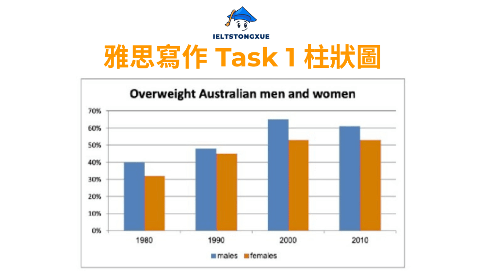
雅思小作文柱狀圖範文 (186 字):
The bar chart illustrates the proportion of overweight men and women in Australia across four distinct time periods spanning three decades from 1980 to 2010.
Overall, both genders experienced a notable upward trend in overweight rates throughout the period, with males consistently recording higher percentages than females. The gap between the two groups widened considerably by 2000 before narrowing slightly in the final decade.
In 1980, approximately 40% of Australian men were classified as overweight, compared to roughly 32% of women. Over the following decade, both figures climbed steadily, reaching around 48% for males and 45% for females by 1990. This upward trajectory continued into 2000, when male overweight rates peaked at approximately 65%, significantly outpacing the female rate of 53%.
The final period from 2000 to 2010 saw a slight divergence in trends. While the male percentage declined marginally to around 62%, the female figure remained relatively stable at approximately 53%, suggesting that the obesity challenge affected both genders persistently throughout the three-decade period.
2. 雅思小作文柱狀圖: The world production output from Asia, Europe, and the rest of the world in different years
題目: The bar chart shows the world production output from Asia, Europe, and the rest of the world in different years between 1840 and 2000. Summarise the information by selecting and reporting the main features, and make comparisons where relevant.
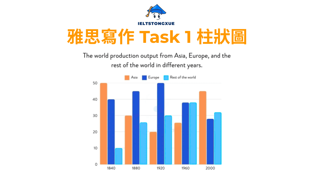
雅思小作文柱狀圖範文 (192 字):
The bar chart compares production output levels across three global regions—Asia, Europe, and the rest of the world—at five distinct points over a 160-year period from 1840 to 2000.
Overall, the data reveals a dramatic shift in global production dominance. Europe maintained leadership throughout the 19th and early 20th centuries before declining sharply, while Asia experienced an inverse pattern, starting strong before collapsing and then recovering significantly by 2000. The rest of the world demonstrated relatively steady growth until the latter half of the 20th century.
In 1840, Asia led global production with approximately 50 units, substantially exceeding Europe’s 40 units and dwarfing the rest of the world’s mere 10 units. However, by 1880, Europe had surged to roughly 45 units while Asia plummeted to 30 units. This European dominance peaked in 1920 at around 50 units, coinciding with Asia’s lowest point of approximately 20 units.
The period after 1920 witnessed a remarkable reversal. By 2000, Asia had rebounded dramatically to about 45 units, while Europe collapsed to roughly 28 units. Meanwhile, the rest of the world maintained a moderate presence, fluctuating between 25 and 38 units throughout the entire timeframe.
3. 雅思小作文柱狀圖: Percentage of government spending on road and transport (1990-2005)
題目: The bar chart shows the percentage of government spending on road and transport in four countries (Italia, Portugal, UK, and USA) across four different years: 1990, 1995, 2000, and 2005. Summarise the information by selecting and reporting the main features, and make comparisons where relevant.
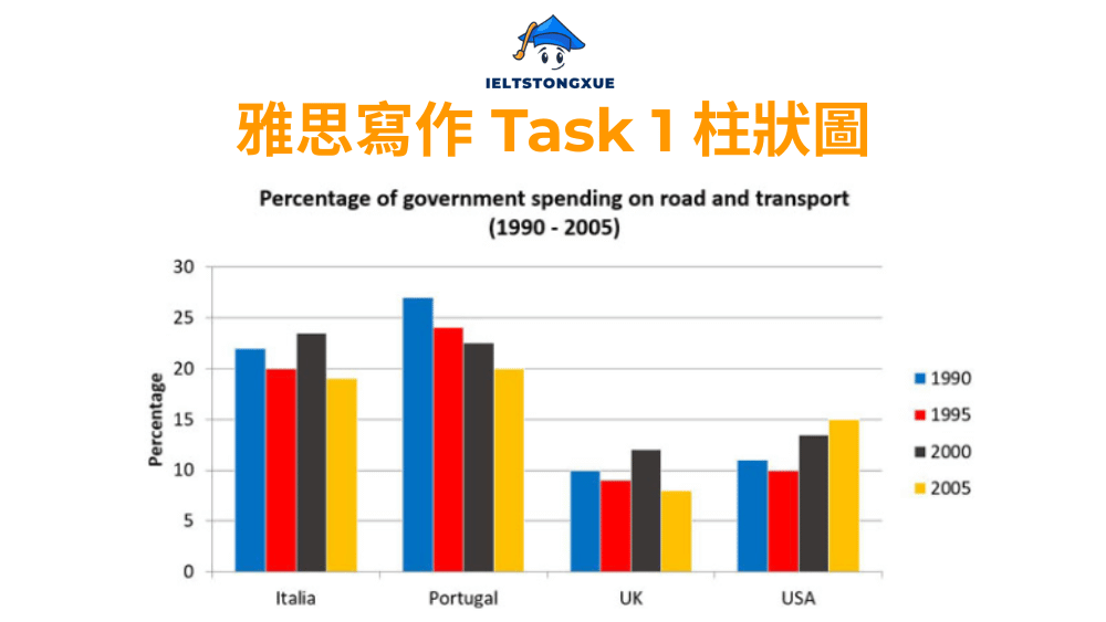
雅思小作文柱狀圖範文 (198 字):
The bar chart compares the proportion of government expenditure allocated to road and transport infrastructure in four countries—Italia, Portugal, the UK, and the USA—at four distinct time points spanning fifteen years from 1990 to 2005.
Overall, Portugal consistently devoted the highest percentage of its budget to transport throughout the period, while the UK maintained the lowest spending levels. Most countries demonstrated a general declining trend, with the USA representing a notable exception by increasing its allocation over time.
In 1990, Portugal led with approximately 27% of government spending directed toward transport, followed closely by Italia at around 22%. The UK and USA recorded considerably lower figures, at roughly 10% and 11% respectively. By 1995, Portugal’s spending had declined marginally to about 24%, while Italia’s dropped to 20%, and both the UK and USA remained relatively stable at approximately 9% and 10%.
The pattern continued into the latter period. By 2005, Portugal and Italia had both reduced their allocations to around 20% and 19% respectively, while the UK decreased further to approximately 8%. In contrast, the USA demonstrated an upward trajectory, reaching nearly 15% by 2005, making it the only country to increase transport spending throughout the fifteen-year timeframe.
4. 雅思小作文柱狀圖: People who ate five portions of fruit and vegetables per day
題目: The bar chart shows the percentage of people who ate five portions of fruit and vegetables per day in three groups (Men, Women, and Children) from 2001 to 2008. Summarise the information by selecting and reporting the main features, and make comparisons where relevant.
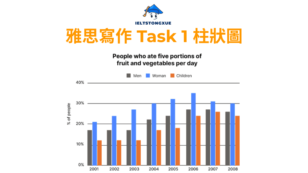
雅思小作文柱狀圖範文 (194 字):
The bar chart illustrates the proportion of three demographic groups—men, women, and children—who consumed the recommended five portions of fruit and vegetables daily over an eight-year period from 2001 to 2008.
Overall, women consistently demonstrated the highest adherence to healthy eating guidelines throughout the period, while children recorded the lowest percentages. All three groups exhibited an upward trend until 2006, followed by a slight decline in the final two years, with the peak occurring around 2006.
In 2001, approximately 21% of women met the daily recommendation, compared to roughly 17% of men and merely 12% of children. This pattern of female dominance persisted throughout the timeframe. By 2004, women’s participation had increased to around 30%, while men and children reached approximately 22% and 17% respectively.
The trend peaked in 2006, when women’s percentage climbed to approximately 35%, accompanied by men at 27% and children at 24%. However, the subsequent period witnessed a marginal decline across all groups. By 2008, women’s figure had decreased slightly to around 30%, men’s to approximately 26%, and children’s to about 24%, suggesting that maintaining healthy eating habits remained challenging despite initial improvements.
5. 雅思小作文柱狀圖: The number of Museum Visitors from 2007 to 2012
題目: The bar chart shows the number of visitors to three London Museums (National Gallery, Victoria and Albert Museum, and British Museum) between 2007 and 2012. Summarise the information by selecting and reporting the main features, and make comparisons where relevant.
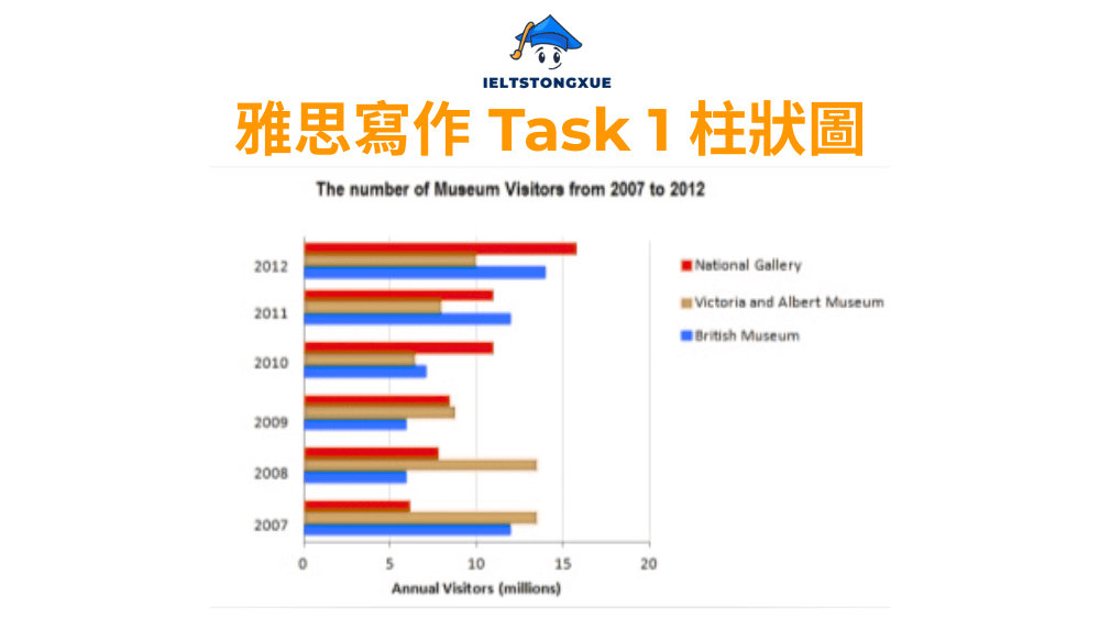
雅思小作文柱狀圖範文 (189 字):
The bar chart compares annual visitor numbers at three prominent London museums—the National Gallery, Victoria and Albert Museum, and British Museum—over a six-year period from 2007 to 2012.
Overall, the British Museum consistently attracted the highest number of visitors throughout most of the period, while the Victoria and Albert Museum generally recorded the lowest figures. All three institutions demonstrated fluctuating patterns rather than steady growth or decline, with 2012 marking a convergence in visitor numbers across the museums.
In 2007, the British Museum led with approximately 14 million visitors, significantly exceeding the National Gallery’s 11 million and the Victoria and Albert Museum’s roughly 9 million. The following year saw the British Museum surge to around 15 million, while its counterparts remained relatively stable at approximately 10 million and 8 million respectively.
From 2009 onwards, visitor numbers across all three venues declined before stabilizing. By 2012, the gap between the museums had narrowed considerably, with all three attracting approximately 10 to 11 million visitors. This convergence suggests that external factors, possibly economic conditions or tourism trends, may have influenced visitor patterns more significantly than individual museum appeal during the latter years of the period.
V. 雅思小作文柱狀圖中常見的三個錯誤與改進方法
即使掌握了結構與詞彙,許多考生仍會在實際寫作中犯下一些常見錯誤,導致分數無法突破 6.5 分。這些錯誤往往源於對評分標準的誤解,或是缺乏對文章邏輯性的重視。了解這些錯誤並學習改進方法,能夠幫助你在短時間內提升寫作品質,避免不必要的失分。
以下三個錯誤是考官在評分時最常見到的問題,它們分別影響「任務完成度」、「連貫性與銜接性」,以及「詞彙資源」三個評分標準。透過具體的錯誤範例與正確寫法對比,你將能夠清楚了解問題所在,並在自己的寫作中加以避免。
1. 錯誤一: 流水帳式地羅列數據
許多考生誤以為雅思小作文柱狀圖的任務是「翻譯」圖表數據,因此逐一描述每個數值,卻沒有進行任何分析或比較。這種寫法不僅缺乏邏輯性,更無法展現你對數據的理解能力,導致「任務完成度」得分偏低。
| 錯誤範例 | 問題分析 | 正確寫法 |
| In 2020, Germany had 55%. Denmark had 48%. Sweden had 45%. Czech had 32%. Poland had 28%. | 僅羅列數據,沒有任何比較或分組,缺乏邏輯連接,讀起來像數據清單而非分析文章 | Germany recorded the highest renewable energy consumption at 55%, followed closely by Denmark and Sweden at 48% and 45% respectively. In contrast, the Czech Republic and Poland had considerably lower figures, at 32% and 28%. |
正確寫法的優點在於將五個國家分為兩組(高數值組與低數值組),並使用比較詞彙(highest, followed by, in contrast, considerably lower)建立數據之間的關係,讓文章具有分析深度與邏輯性。
2. 錯誤二: 加入個人觀點或臆測原因
雅思小作文柱狀圖是客觀的資料報告 (report),而非議論文 (essay)。你的任務是描述與分析圖表中已有的資訊,而非解釋數據背後的原因或提出個人看法。加入主觀意見會被視為偏離任務要求,影響「任務完成度」得分。
| 錯誤範例 | 問題分析 | 正確寫法 |
| Germany has the highest figure because the government invested heavily in renewable energy. This is good for the environment. | 加入了原因解釋(政府投資)與個人評價(對環境有益),這些資訊並未出現在圖表中,屬於臆測與主觀判斷 | Germany recorded the highest renewable energy consumption at 55%, which was approximately 10 percentage points higher than Denmark, the second-ranked country. |
正確寫法聚焦於數據本身的描述與比較,沒有加入任何推測或評價,保持了報告的客觀性與專業性,這正是考官期待看到的寫作風格。
3. 錯誤三: 總覽段與主體段信息混淆
Overview 應該只包含主要特徵與整體趨勢,不應出現具體數據。相反地,Body Paragraphs 則需要詳細的數據支撐。許多考生無法清楚區分兩者,導致 Overview 過於詳細,或是 Body Paragraphs 過於籠統,影響文章的邏輯層次。
| 錯誤範例 | 問題分析 | 正確寫法 |
| Overall, Germany had 55%, Denmark had 48%, and Sweden had 45%. | Overview 中出現過多具體數據,失去了「總覽」的功能,變成了詳細描述,這應該是 Body Paragraph 的內容 | Overall, Germany recorded the highest renewable energy consumption, significantly surpassing all other countries, while Poland had the lowest figure. The gap between the top and bottom performers was substantial. |
正確寫法僅描述主要特徵(最高與最低國家、差距大小),沒有列出具體數值,讓 Overview 保持了高層次的總結功能,為後續的 Body Paragraphs 留下詳細描述的空間。
當你掌握了以上所有技巧後,你可能會思考:如何讓你的文章更具洞察力?如何在有限的 150 字內,既完成任務要求,又展現語言的精準度與多樣性?接下來的問答環節將解答你可能存在的進階疑問,幫助你理解考官評分標準的深層邏輯,讓你的雅思小作文 Bar graph 寫作達到更高境界。
VI. 雅思小作文柱狀圖的問答
1. 何謂考官評分標準中的「有意義的比較」(Meaningful Comparison)?
有意義的比較指的是你所進行的數據對比,能夠揭示關鍵差異或重要關係,而非隨意挑選兩個數據進行比較。例如,比較數值最高與最低的項目,或是比較增長最快與最慢的類別,這些都是有意義的比較,因為它們展現了數據的極端情況與分布特徵,讓讀者能夠快速掌握圖表的核心資訊。
2. 描述柱狀圖時,我是否可以完全不提具體數字?
不建議完全省略數字。雖然 Overview 不需要具體數據,但 Body Paragraphs 必須包含足夠的數據支撐,才能達到「任務完成度」的要求。你應該在每個 Body Paragraph 中選擇性地提及關鍵數值,例如極端值、特別顯著的變化,或是需要進行比較的數據,但不必羅列所有數字,保持適度的數據密度是關鍵。
3. 同樣是比較數據,柱狀圖與表格題 (Table) 在寫作側重點上有何不同?
柱狀圖強調視覺化的比較與趨勢識別,你的重點應放在描述數據的高低差異、變化軌跡,以及整體模式。表格題則包含更多細節資訊,通常需要你進行更精細的數據分組與多維度比較,例如同時比較不同項目在不同時間點的表現,因此表格題的寫作往往更加複雜,需要更清晰的邏輯結構來組織大量資訊。
4. 哪些主題類型的柱狀圖(如:經濟、教育、環境)在近年考試中出現頻率最高?
根據近年的考試趨勢分析,環境與能源、教育與就業、人口與社會發展這三大主題出現頻率最高。環境主題常涉及再生能源使用、碳排放、廢棄物處理等議題;教育主題涵蓋各年齡層的教育程度、高等教育入學率、培訓投資等;人口主題則包括年齡分布、城鄉人口比例、移民趨勢等,熟悉這些主題的常用詞彙與表達,能讓你在考場上更加從容應對。
總結
透過本文的系統性學習,你已經完成了從「描述者」到「分析師」的蛻變。你現在理解了雅思小作文柱狀圖的本質不在於翻譯數據,而在於展現你對資訊的整理、分析與表達能力。這個能力的提升不僅能幫助你在 IELTS Writing task 1 Bar chart 中取得理想成績,更是你未來學術寫作與專業報告的重要基礎。
為了確保你能夠在考試中有效運用這些技巧,請記住以下核心要點:在審題階段務必識別圖表類型(動態或靜態),因為這決定了你的詞彙選擇;在 Overview 段落中只描述主要特徵,絕不包含具體數據;在 Body Paragraphs 中採用合理的分段邏輯,展現你的分析思維;持續擴充你的詞彙庫,從基礎表達升級至學術用語;避免三個常見錯誤(流水帳、主觀臆測、段落混淆)。
記住,雅思寫作的高分不是一蹴而就的結果,而是系統性準備與持續練習的成果。IELTSTongXue 相信每位學習者都擁有提升語言能力的潛力,只要你願意投入時間,運用正確的方法,從 6 分進步到 8 分絕非遙不可及的目標。現在,請拿起筆開始練習,將本文所學應用於實際寫作中,你將會發現自己的進步比想像中更快,祝你在雅思考試中取得理想成績,實現你的國際化目標!