


雅思小作文綜合圖表到底難在哪裡?為什麼許多考生能在單一圖表題型穩定拿到 6 分,卻在面對 Mixed Charts 時分數總是卡關?答案其實很明確:綜合圖表考驗的不只是數據描述能力,更是你整合多組資訊、建立圖表關聯性的分析思維。當兩張不同類型的圖表(例如線圖搭配柱狀圖、餅圖配合表格)同時出現在考卷上時,多數考生會陷入「分開描述」的陷阱,僅僅機械式地報告「第一張圖顯示什麼、第二張圖顯示什麼」,結果往往只能徘徊在 5.5 到 6 分之間。但如果你能掌握正確的結構框架,學會在總覽段建立核心關聯,並在主體段中有意義地比較兩組數據,突破到 7 分甚至 8 分絕非遙不可及的夢想。
根據 IELTSTongXue 多年的教學觀察與數千份考生作文分析,我們發現高分答卷都有一個共同特質:它們不把綜合圖表視為兩個獨立任務的疊加,而是將其視為一個需要綜合思考的整體挑戰。這篇終極指南將為你完整拆解雅思小作文綜合圖表的所有關鍵環節,從四段式結構的精準運用、進階分析技巧的深度掌握,到五篇 Band 7.0 以上的逐句點評範文。無論你目前處於哪個分數階段,這份指南都將成為你通往高分的可靠路線圖,幫助你在 2026 年的雅思考試中自信應對任何圖表組合,實現分數的實質性突破。
I. 何謂雅思小作文綜合圖表?不只是兩張圖的簡單相加
雅思小作文綜合圖表,英文稱為 Mixed Charts 或 Multiple Graphs,指的是在同一道題目中出現兩張或以上不同類型的圖表。這些圖表可能包含線圖 (line graph)、柱狀圖 (bar chart)、餅圖 (pie chart) 或表格 (table)。關鍵在於,這些圖表通常圍繞著同一個主題或相關聯的數據呈現。
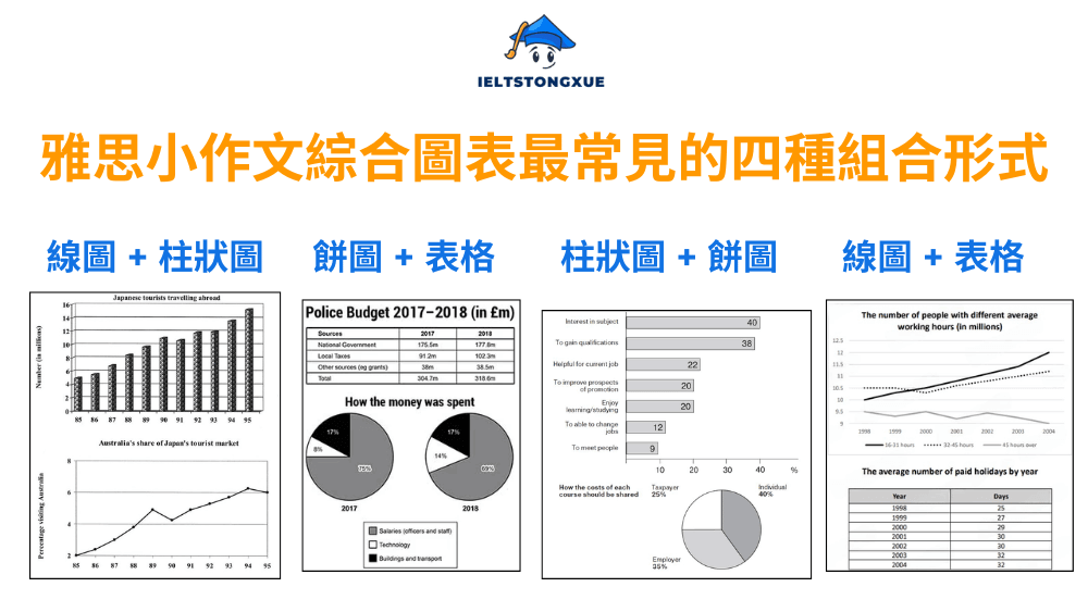
最常見的四種組合形式包括:
- 線圖 + 柱狀圖: 這種組合通常考核你比較趨勢變化與特定數值的能力。線圖可能顯示某項指標隨時間的演變,而柱狀圖則呈現不同類別在特定時間點的數據對比。
- 餅圖 + 表格: 此組合著重於比例分配與具體數據的結合。餅圖展現整體中各部分的百分比,表格則提供更詳細的數字資訊或額外的分類維度。
- 柱狀圖 + 餅圖: 這種配對要求你同時處理類別比較(柱狀圖)與整體比例(餅圖)。兩者可能展示同一現象的不同角度或相關聯的兩個層面。
- 線圖 + 表格: 這組合考驗你整合動態趨勢(線圖)與靜態數據(表格)的能力。你需要從時間演變和具體數字兩個維度來分析資訊。
許多考生誤以為雅思小作文 Mixed Charts 只是將兩個單獨圖表的描述拼湊在一起。這種認知導致他們的文章缺乏整體性,僅是機械式地陳述「The first chart shows… The second chart shows…」,結果往往只能獲得 IELTS 5.5 到 IELTS 6 分。考官真正尋找的是什麼? 從評分標準來看,Band 7 IELTS 以上的答案必須展現對資訊的綜合分析能力。你需要在描述中建立兩張圖表之間的邏輯關聯,找出它們共同呈現的核心訊息或對比關係。這種整合思維的展現,正是區分中等分數與高分的分水嶺。當你能夠透過文字將看似獨立的兩組數據編織成一個有意義的敘事時,你就掌握了 IELTS Writing Task 1 Mixed Charts 的精髓。接下來,讓我們深入探討如何構建這樣的高分答案。
看更多文章:
- 雅思小作文線圖:高分結構與詞彙策略解析
- 雅思小作文柱狀圖終極指南:結構+詞彙+範文全解析
- 雅思小作文餅圖終極指南:從零到滿分的實戰秘訣
- 雅思小作文表格高分秘訣:20分鐘內寫出7分作文的方法
- 雅思小作文流程圖終極指南:詞彙、範文、高分策略
- 雅思小作文地圖終極指南:Band 7.0+高分策略
II. 雅思小作文綜合圖表的四個部分
成功的雅思小作文綜合圖表遵循一個清晰且經過驗證的結構。這個結構由四個核心部分組成:引言 (Introduction)、總覽 (Overview)、以及兩個主體段 (Body Paragraphs)。每個部分都有其特定的功能與寫作要點。掌握這個框架,你就擁有了一張可靠的寫作藍圖,無論面對何種圖表組合都能從容應對。
以下IELTSTongXue將逐一拆解這四個部分的寫作要領,提供你可以立即套用的策略與範例。
1. 第一段:引言 (Introduction)
引言段的主要目的是用你自己的話重新表述題目,告訴考官這些圖表呈現什麼資訊。這裡的關鍵是改寫 (paraphrase),而不是照抄原題。考官希望看到你的語言轉換能力。一個有效的引言通常包含三個要素:圖表類型、主題內容、時間或地點範圍。你可以透過同義詞替換、句型轉換或詞性變化來實現改寫。
實用的改寫技巧包括:
| 原題用語 | 改寫選項 |
|
|
|
|
|
|
|
|
範例句型:當題目是 The charts below show the percentage of water used for different purposes in six areas of the world. 你可以改寫為:
- The given illustrations present data on how water resources were allocated across various purposes in six global regions.
- 或者 The pie charts provide information about the proportions of water consumption dedicated to different uses in six parts of the world.
關鍵是保持原意的同時展現語言的靈活性。引言不需要長篇大論,一到兩個清晰的句子就足夠了。
2. 第二段:總覽 (Overview)
總覽段是整篇文章中最重要的部分,它直接影響你在「任務完成度」(Task Achievement) 評分標準上的表現。一個缺失或薄弱的總覽段幾乎不可能讓你達到 Band 7。總覽段的核心功能是總結兩張圖表中最顯著、最重要的特徵,並且建立它們之間的關聯。這裡有兩個不可違背的原則:
- 原則一:聚焦宏觀特徵,絕對不寫具體數據。 總覽段關注的是整體趨勢、主要模式或突出對比,而非特定的百分比或數值。例如,你可以說「The line chart shows an upward trend across all categories」,但不應該說「category A increased from 20% to 40%」。
- 原則二:建立兩張圖表的核心關聯。 這是綜合圖表區別於單一圖表的關鍵。你需要思考:這兩張圖是否展現相同的趨勢?是否呈現對比?是否一張圖解釋另一張圖的原因?找到這種關聯並在總覽段中明確表達出來。
如何撰寫高分總覽段:
| 步驟一 | 分別找出每張圖表中最明顯的一到兩個特徵。對於線圖,可能是整體上升或下降的趨勢;對於柱狀圖,可能是哪個類別數值最高;對於餅圖,可能是哪個部分佔比最大。 |
| 步驟二 | 將這些特徵連結起來。使用連接詞如 “while”、”whereas”、”in contrast” 來建立對比關係,或使用 “similarly”、”likewise”、”correspondingly” 來顯示相似性。 |
| 範例:Overall, both charts demonstrate a clear upward trend in technology adoption across all age groups during the examined period. The line graph reveals a consistent increase in internet usage, while the bar chart shows that younger demographics maintained significantly higher engagement levels throughout. | |
⚠️ 警告: 許多考生在總覽段中列舉過多細節或包含數據,這會削弱總覽段的效力。記住,總覽段是「鳥瞰視角」,而非「顯微鏡觀察」。
3. 第三、四段:主體段 (Body Paragraphs)
主體段是你詳細描述數據的地方。這裡你需要用具體的數字和事實來支撐你在總覽段中提出的觀點。面對綜合圖表,主體段的組織策略至關重要。
最有效的分段策略:
- 策略一:按圖表類型分段。 第一個主體段描述第一張圖表(例如線圖),第二個主體段描述第二張圖表(例如柱狀圖)。這種方法結構清晰,容易掌控。但要注意,即使分開描述,你仍需在適當處加入對比或關聯性的語句,避免讓兩段看起來完全孤立。
- 策略二:按時間或類別分段。 如果兩張圖表都涉及時間演變,你可以第一段描述前半段時期兩張圖的數據,第二段描述後半段時期。或者,如果圖表涉及多個類別,你可以第一段聚焦主要類別在兩張圖中的表現,第二段則討論次要類別。這種方法更具整合性,但需要更強的組織能力。
數據篩選的藝術:你不可能也不應該描述圖表中的每一個數據點。考官評估的是你選擇關鍵資訊的能力。優先選擇那些:
- ✅最高值與最低值: 極端數據往往最具代表性。
- ✅顯著變化: 大幅度的增長或下降值得特別提及。
- ✅有意義的對比: 兩個類別或時間點之間的明顯差異。
- ✅支持總覽觀點的數據: 你在總覽段中提出的主要特徵需要在主體段中用具體數據來佐證。
當你選擇數據時,始終問自己:「這個數字是否幫助讀者理解圖表的核心訊息?」如果答案是否定的,那就省略它。精準的數據選擇展現你的分析判斷力,這正是高分作文的特質之一。
III. 從6分到8分:三大進階技巧深化你的分析能力
掌握基本結構能讓你穩定達到 IELTS 6 到 IELTS 6.5 分,但要突破到 IELTS 7 分甚至 IELTS 8 分,你需要在思維深度和語言精準度上更進一步。以下三個進階技巧將幫助你從「能寫」提升到「寫得好」,讓你的雅思小作文綜合圖表展現真正的專業水準。
1. 進階技巧1:挖掘數據背後的「故事線」,而不只是羅列事實
Band 6 的作文往往只是機械式地報告數字:「A 是 30%,B 是 40%,C 是 50%。」而 Band 8 的作文則像一位分析師,能從數據中看出趨勢、發現關聯、理解意涵。你需要訓練自己成為一名「數據偵探」。當你看到兩張圖表時,不要立刻開始寫作,而是先花 2-3 分鐘思考以下問題:
- 這兩張圖表是否展現因果關係? 例如,如果一張線圖顯示教育支出增加,另一張柱狀圖顯示識字率提升,你可以暗示這種可能的關聯:「As education spending has steadily increased, literacy rates have also shown a corresponding upward trend, which may reflect the positive relationship between investment and outcomes.」
- 是否存在對比或矛盾? 如果一個地區某項指標上升而另一項下降,這種對比值得突出:「It is worth noting that although Country A’s economic growth rate has increased significantly, its environmental quality indicators have declined at the same time.」
- 是否有某個類別始終領先或落後? 持續的領先地位或一貫的弱勢也是一種模式:「Throughout the observation period, younger groups maintained a significant advantage on both indicators, and this persistent difference highlights a clear generational divide.」
- 數據的變化幅度是否不同? 有些類別可能變化劇烈,有些則相對穩定:「Compared to the volatile growth of Category A, Category B has shown a more stable and predictable development trajectory.」
這種分析性的表述不僅展現你的批判性思維,也讓你的文章從單純的資訊傳遞昇華為洞察分享。
2. 進階技巧2:活用「比較與對比」的高級詞彙與句型,展現語言駕馭力
綜合圖表的本質就是比較。你需要一個豐富的IELTS詞彙庫來準確且多樣化地表達各種比較關係。重複使用 “higher than” 或 “more than” 會讓你的文章顯得單調。以下是按功能分類的進階比較詞彙與句型:
| 功能 | 基礎表達 | 進階表達 | 範例 |
| 顯著差異 | much higher than | considerably / substantially / markedly higher than | A exceeded B by a substantial margin of 25 percentage points. |
| 輕微差異 | slightly more than | marginally / moderately / fractionally more than | The figure for X was marginally higher, reaching 32% compared to Y’s 30%. |
| 相似性 | similar to | comparable to / closely aligned with / paralleled | The trend in urban areas closely paralleled that observed in rural regions. |
| 對比 | while / but | whereas / in contrast / conversely | Region A experienced growth, whereas Region B witnessed a decline. |
| 比例關係 | twice as much | double / twofold / half the size of | Category X accounted for double the proportion seen in Category Y. |
| 排名 | the highest | the leading / the dominant / topped the list | Country A topped the list with 45%, followed by Country B at 32%. |
進階句型範例:
- 倒裝結構強調對比: While the male participation rate remained relatively stable at around 65%, that of females witnessed a dramatic surge from 35% to 58%.
- 分詞結構簡化句子: Standing at merely 15% in 2000, the renewable energy share more than tripled over the decade, reaching 48% by 2010.
- 同位語補充說明: The transportation sector, the largest consumer of energy, accounted for 40% of total usage, significantly outpacing the industrial sector at 25%.
運用這些高級詞彙和句型不是為了炫技,而是為了更精準、更優雅地傳達資訊。選擇合適的表達方式能讓你的分析更具說服力。
3. 進階技巧3:精準用詞,讓你的數據描述從「準確」提升至「生動」
描述數據動態是雅思小作文的核心技能之一。使用多樣化且精準的動詞能讓你的文章更具表現力,同時避免語言重複。
| 描述上升的進階詞彙 |
|
| 描述下降的進階詞彙 |
|
| 描述波動與穩定 |
|
| 描述程度的副詞 |
|
範例應用:
- 普通表達:The number increased from 20 to 50.
- 進階表達:The figure surged dramatically from a mere 20 in 2000 to a peak of 50 by 2010, representing a more than twofold expansion.
- 或者:After climbing steadily from 20 to 35 during the initial five-year period, the figure subsequently accelerated, soaring to 50 by the decade’s end.
這種精準且豐富的語言使用不僅滿足「詞彙資源」(Lexical Resource) 的評分要求,也讓你的文章讀起來更加流暢自然。想更深入了解這項標準,您可以參考 IELTSTongXue! 的文章:《雅思寫作分數:從官方標準到 9 分的終極指南》!
IV. Band 7.0+ 雅思小作文綜合圖表範文
理論學習固然重要,但真正的理解來自於觀察高分範文如何將這些原則付諸實踐。以下五篇 Band 7.0 以上的範文涵蓋不同的圖表組合,每篇範文後都附有詳細的逐句點評,幫助你理解每個句子在結構、邏輯和詞彙上的優點。
1. 雅思小作文綜合圖表:Reasons for travel and the main issues for the travelling public in the US in 2009
主題:The charts below show reasons for travel and the main issues for the travelling public in the US in 2009.
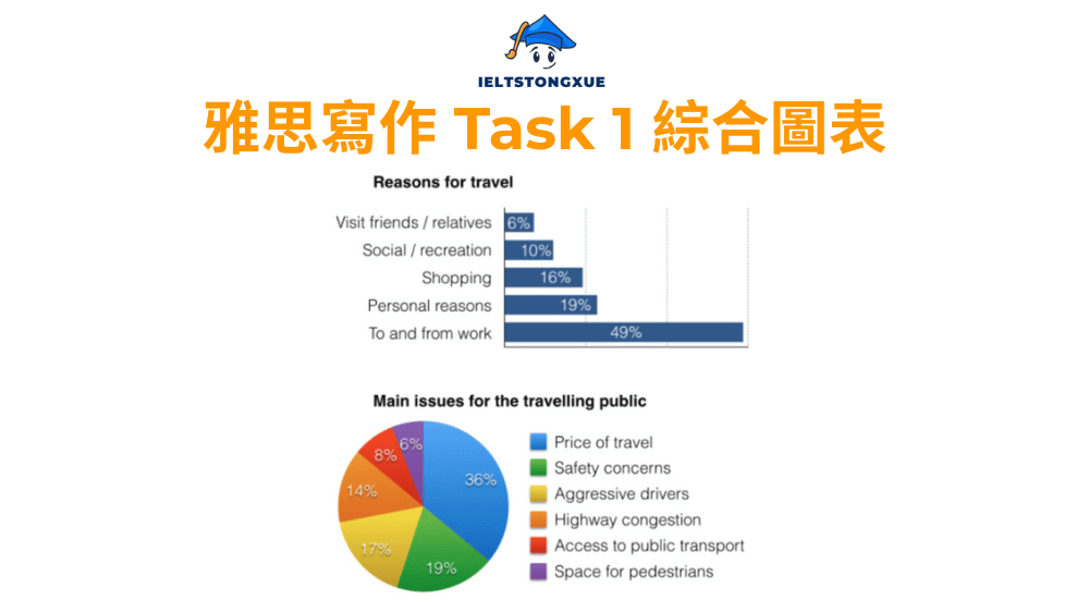
雅思小作文綜合圖表範例:
The bar chart and pie chart present data on why Americans travelled and what problems they encountered during their journeys in 2009. Overall, work-related commuting dominated travel purposes by a substantial margin, while travel costs emerged as the predominant concern for the travelling public, affecting more than one-third of respondents.
Regarding reasons for travel, journeys to and from work accounted for nearly half of all trips at 49%, dwarfing all other categories. Personal reasons ranked second at 19%, followed by shopping at 16%. Social and recreational activities represented merely 10% of travel purposes, while visiting friends or relatives constituted the smallest proportion at 6%. This pattern reveals that functional necessity rather than leisure drove the majority of American travel behaviour during this period.
Turning to travel-related challenges, the price of travel topped the list of grievances at 36%, indicating that financial considerations posed the most significant barrier. Highway congestion troubled 17% of travellers, while aggressive drivers affected 19%, suggesting that road safety and traffic flow issues collectively impacted more than one-third of the travelling public. Safety concerns accounted for a further 14%, whereas access to public transport and pedestrian space represented relatively minor issues at 8% and 6% respectively. Notably, the dominance of cost-related concerns aligns with the high proportion of work commuting, as daily travel expenses would disproportionately affect regular commuters.
2. 雅思小作文綜合圖表:Water use worldwide and water consumption in two different countries
主題:The graph and table below give information about water use worldwide and water consumption in two different countries.
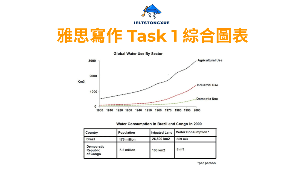
雅思小作文綜合圖表範例:
The line graph illustrates global water consumption across three sectors from 1900 to 2000, while the table compares specific water usage indicators in Brazil and the Democratic Republic of Congo during the year 2000. Overall, agricultural water use dominated throughout the century and experienced the most dramatic expansion, whereas the two countries exhibited starkly contrasting patterns in both irrigation scale and per capita consumption levels.
Examining worldwide trends, agricultural water usage began at approximately 500 cubic kilometres in 1900 and surged dramatically to reach roughly 3,000 cubic kilometres by 2000, representing a sixfold increase over the century. Industrial consumption, starting from nearly negligible levels, climbed steadily to around 1,200 cubic kilometres, while domestic use rose more gradually from about 100 to approximately 500 cubic kilometres during the same timeframe. Agricultural demands clearly outpaced the other two sectors throughout the entire period.
Regarding country-specific data, Brazil demonstrated substantially higher figures across all metrics. Its irrigated land covered 26,500 square kilometres, approximately 265 times the area in Congo, which stood at merely 100 square kilometres. Similarly, Brazil’s per capita water consumption reached 359 cubic metres annually, dramatically exceeding Congo’s modest figure of 8 cubic metres. These disparities likely reflect profound differences in agricultural infrastructure, industrial development, and economic capacity between the two nations, with Brazil’s extensive irrigation systems correlating directly with higher individual water consumption patterns.
3. 雅思小作文綜合圖表:The population in Australia according to different nationalities and areas
主題:The table and pie chart give information about the population in Australia according to different nationalities and areas. Summarize the information by selecting and reporting the main features and make comparisons where relevant.
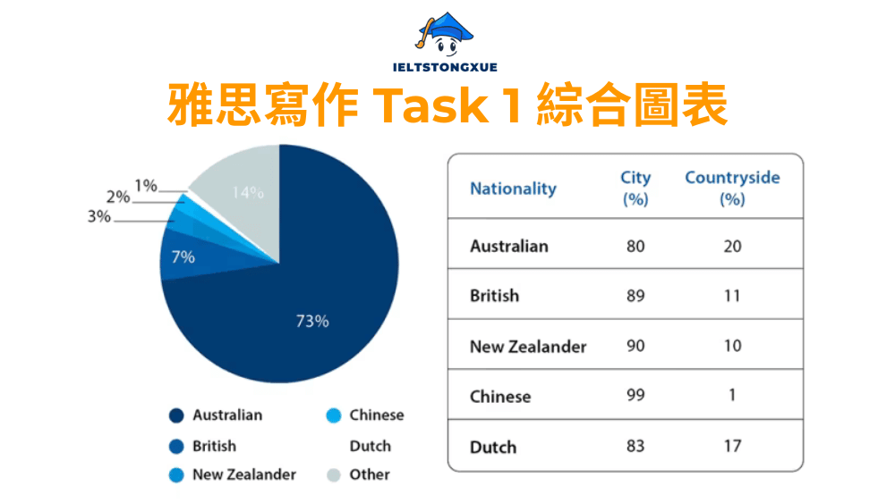
雅思小作文綜合圖表範例:
The pie chart illustrates the distribution of Australia’s population by nationality, while the accompanying table compares urban-rural settlement patterns across five nationality groups. Overall, Australian-born residents constituted the overwhelming majority of the population, and all nationality groups demonstrated a pronounced preference for urban living, though the extent of this concentration varied considerably.
Regarding nationality composition, Australians comprised 73% of the total population, dwarfing all other groups. British residents formed the second-largest community at 7%, followed by New Zealanders at 3%. Chinese and Dutch populations each accounted for approximately 1% to 2%, while other nationalities collectively represented around 14% of residents. This distribution highlights Australia’s predominantly native-born population despite its multicultural character.
Turning to geographical preferences, the table reveals striking urban concentration across all groups, with city dwelling ranging from 80% to 99%. Chinese residents exhibited the most extreme urban clustering at 99%, leaving merely 1% in countryside areas. New Zealanders followed closely at 90% urban concentration, while British residents showed 89%. Australians and Dutch displayed relatively more balanced distributions at 80% and 83% urban respectively, though rural populations remained minorities in both cases. The consistently high urban percentages suggest that metropolitan areas offer compelling advantages in employment opportunities, infrastructure, and lifestyle amenities that transcend nationality, though recent immigrant communities appear particularly drawn to city environments where established ethnic networks and services may ease settlement challenges.
4. 雅思小作文綜合圖表:The cinema attendants in Australia and the average cinema visits by different age groups from 1996 to 2000
主題:The graphs below show the cinema attendants in Australia and the average cinema visits by different age groups from 1996 to 2000. Summarise the information by selecting and reporting the main features, and make comparisons where relevant.
雅思小作文綜合圖表範例:
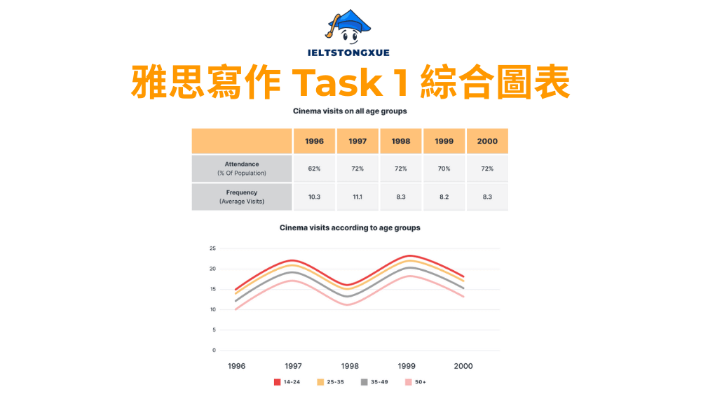
The table and line graph present data on overall cinema attendance and age-specific visit frequencies in Australia between 1996 and 2000. Overall, total attendance demonstrated fluctuating patterns with an eventual recovery, while younger demographics consistently dominated cinema-going behaviour throughout the entire period, with the gap between age groups remaining remarkably stable.
Examining aggregate trends, cinema attendance stood at 82% of the population in 1996, with visitors averaging 10.3 trips annually. However, attendance declined notably to 70% by 1999, accompanied by a corresponding drop in visit frequency to 8.2 times per year. Interestingly, the year 2000 witnessed a modest recovery to 72% attendance, though the average frequency remained relatively unchanged at 8.3 visits. This pattern suggests that cinema experienced a mid-period slump before partially rebounding.
Regarding age-specific behaviour, the line graph reveals that the 14-24 bracket consistently led all groups, maintaining visit frequencies between 15 and 22 times annually throughout the period. The 25-35 age group followed steadily at around 10-12 visits, while those aged 35-49 averaged 8-11 cinema trips. The 50-plus category recorded the lowest engagement at approximately 6-8 visits yearly. Notably, all age groups exhibited similar trajectory patterns, declining from 1996 to 1998, then surging in 1999 before moderating in 2000. This synchronized movement across demographics suggests that external factors such as film quality, ticket prices, or competing entertainment options affected all age segments simultaneously, though younger audiences maintained their substantially higher engagement regardless of these broader trends.
5. 雅思小作文綜合圖表:The result of a survey of adult education
主題:The charts below show the result of a survey of adult education. The first chart shows the reason why adults decide to study. The pie chart shows how people think the costs of adult education should be shared.
雅思小作文綜合圖表範例:
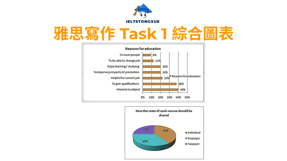
The bar chart illustrates various motivations driving adult participation in education, while the pie chart breaks down public opinion on how course costs should be distributed among stakeholders. Overall, subject interest emerged as the dominant driver for adult learning, surpassing even career-oriented motivations, and financial responsibility was viewed as a relatively balanced obligation across individuals, employers, and taxpayers.
Examining reasons for study, interest in the subject topped the list at 40%, indicating that intrinsic intellectual curiosity plays a crucial role in adult education engagement. Gaining qualifications ranked second at 38%, closely followed by career advancement benefits at 22%. Improving promotion prospects attracted 20% of respondents, while the ability to change jobs appealed to 12%. Notably, purely social motivations such as meeting people accounted for merely 9%, and enjoying learning itself represented 20%. This distribution suggests that adult education serves dual purposes, fulfilling both practical career needs and personal intellectual development goals in roughly equal measure.
Regarding cost allocation, the pie chart reveals that 40% of respondents believed individuals should bear the largest share of expenses, slightly exceeding the employer contribution expectation of 35%. Taxpayer funding through government resources represented 25% of the proposed distribution. This relatively balanced tripartite model indicates public recognition that adult education generates benefits extending beyond individual learners to encompass workplace productivity gains and broader societal advancement, thereby justifying shared investment from all three parties rather than placing the burden exclusively on students.
V. 雅思小作文綜合圖表的自我檢查清單
完成你的雅思小作文綜合圖表後,在提交前花 2-3 分鐘進行自我檢查至關重要。以下清單涵蓋了本指南中強調的所有核心要點。逐一核對這些項目能幫助你發現潛在的疏漏或弱點,確保你的作文達到最佳狀態。
1. 檢查點1:我的總覽段是否清晰總結了主要特徵且無數據?
回頭檢視你的總覽段。問自己:我是否用一到兩句話概括了兩張圖表中最顯著的特徵?這些特徵是否足夠宏觀?我有沒有不小心包含了具體的百分比或數值?總覽段應該是「森林視角」而非「樹木視角」。如果你發現自己寫了 “30%” 或 “500 units” 這樣的具體數字,立即刪除它們,改為更抽象的描述如 “the majority” 或 “experienced significant growth”。
同時確認你是否在總覽段建立了兩張圖表之間的關聯。如果你只是分別描述 “第一張圖顯示…第二張圖顯示…”,那還不夠。嘗試加入連接性語言如 “while”、”whereas”、”correspondingly” 來展現你對整體資訊的綜合理解。
2. 檢查點2:我是否在主體段中有意義地比較了兩個圖表的資訊?
瀏覽你的兩個主體段。即使你選擇按圖表類型分段描述,你仍應該在適當處加入對比或關聯性的語句。檢查是否至少有一到兩處地方你將兩張圖的資訊放在一起討論。
例如,如果一張圖顯示某地區經濟增長,另一張圖顯示同地區教育投資增加,你可以在其中一個主體段末尾加上:”This economic expansion may be partially attributable to the concurrent rise in educational investment, as shown in the second chart.” 這種連結展現了你不僅能描述數據,更能理解數據之間的潛在關係。
如果你的主體段完全孤立,沒有任何跨圖表的比較或連結,那麼你很可能只能達到 Band 6 的水平。立即尋找機會建立這種關聯。
3. 檢查點3:我的詞彙和句型是否富於變化?
進行一次「重複詞檢查」。標記出你使用了兩次以上的動詞(如 “increase”、”show”)、形容詞或連接詞。雅思考官特別注意詞彙的多樣性。如果你發現自己反覆使用同一個詞,參考本指南第三章提供的同義詞列表進行替換。
同時檢查你的句型結構。你是否所有句子都是 “主語 + 動詞 + 賓語” 的簡單結構?嘗試加入一些分詞結構(”Standing at 30%…”)、倒裝句(”While A increased, so did B…”)或同位語(”Category X, the largest group, accounted for…”)來增加句法複雜度。但要注意,複雜性是為了清晰表達,而非為了複雜而複雜。
最後,確認你的文章長度適中(通常 180-220 字是理想範圍)。過短可能意味著資訊不足,過長則可能包含了不必要的細節或冗餘表達。
你已經掌握了雅思小作文綜合圖表的核心策略,從結構框架到進階技巧,從高分範文到自我檢查方法。這些知識為你建立了堅實的寫作基礎。然而,實際應考時你可能仍會遇到一些特殊情況或邊緣問題,這些疑問可能在標準教學中較少被提及。接下來的常見問題解答將處理這些細節層面的疑慮,幫助你應對各種可能出現的特殊情境,讓你的準備更加全面周到。
VI. 雅思小作文綜合圖表的FAQ
1. 「綜合圖表 (Mixed Charts)」與單純的「多圖表 (Multiple Graphs)」在雅思寫作中的要求有何本質區別?
這是一個很好的概念釐清問題。在雅思考試語境中,這兩個術語本質上指的是同一種題型,沒有明確的官方區分。無論題目中出現兩張、三張或甚至四張不同類型的圖表,你的寫作策略都應該保持一致:將它們視為一個整體來分析,而非各自獨立的資訊單元。
關鍵不在於圖表的數量,而在於你是否能建立它們之間的關聯性。有時候,兩張看似完全不同的圖表(如一張線圖加一張餅圖)可能因為共同的主題或時間框架而緊密相關。你的任務是發現並闡明這種關聯。無論你遇到的是 “mixed charts” 還是 “multiple graphs”,都應該採用本指南中介紹的整合性分析方法。
2. 在主體段中,先描述線圖還是先描述柱狀圖,這個順序對分數的影響大嗎?
順序選擇對最終IELTS分數的影響微乎其微,考官關注的是你的分析質量和語言能力,而非描述順序。然而,合理的順序安排能讓你的文章邏輯更加流暢,間接提升整體質量。
一般建議遵循以下原則:如果兩張圖表有明顯的邏輯關係(例如一張圖展示原因,另一張展示結果),先描述「因」再描述「果」會更自然。如果圖表按時間順序呈現資訊(例如一張顯示 1990-2000 年的數據,另一張顯示 2000-2010 年的數據),按時間順序描述更合理。如果沒有明顯的邏輯關係,你可以選擇先描述資訊較多或較重要的圖表,也可以按題目中圖表出現的順序來描述。
最重要的是保持一致性和清晰性。使用明確的過渡短語(如 “Regarding the first chart…” 和 “Turning to the second chart…”)來引導讀者跟隨你的思路。
3. 除了線圖+柱狀圖、餅圖+表格外,還有哪些不常見但可能出現的圖表組合?它們的分析側重點有何不同?
雖然線圖+柱狀圖和餅圖+表格是最常見的組合,雅思考試確實可能出現其他較少見的配對。以下是一些可能性:
- 線圖 + 餅圖: 這種組合通常一個展示動態趨勢(線圖),另一個展示靜態比例(餅圖)。你的分析重點應放在:趨勢變化如何影響最終的比例分佈?或者,比例分佈是否解釋了某些趨勢變化?
- 柱狀圖 + 柱狀圖: 兩個柱狀圖可能展示不同時間點、不同地區或不同群體的相同指標。重點在於尋找對比模式:哪些類別在兩個情境中都保持領先?哪些出現了排名變化?
- 表格 + 表格: 雖然罕見,但可能出現。這種情況下,你需要從大量數據中篩選出最關鍵的資訊,避免陷入細節泥沼。尋找跨表格的對比點或共同趨勢。
- 線圖 + 線圖: 可能展示相同時期內不同指標的變化。關鍵是識別兩條或多條線之間的關係:它們是否同步變化?是否呈現相反趨勢?是否存在時間差?
無論遇到何種組合,核心策略不變:總覽段總結主要特徵並建立關聯,主體段提供支持性數據,始終尋找圖表之間的對話而非孤立描述。
4. 我可以在文章的最後(例如寫第五段)加入一個總結段,重申我的觀點嗎?
這個問題的答案是:不需要,也不建議。雅思小作文 Task 1 的標準結構是四段式:引言、總覽、主體段一、主體段二。加入第五段總結不僅沒有必要,反而可能被視為冗餘。
原因在於,你的總覽段(第二段)本身就已經承擔了總結功能。它提供了對圖表資訊的高層次概括,這已經足夠。在文章末尾再次重複這些資訊並不會增加任何價值,反而浪費了寶貴的時間和字數。
Task 1 與 Task 2 的重要區別在於:IELTS Writing Task 2 要求你表達個人觀點並論證,因此需要結論段來重申立場。但 Task 1 是客觀描述數據,不需要也不應該有個人觀點或結論。你的任務是報告你所看到的資訊,而非得出結論或提出建議。
專注於寫好四個部分,確保每個部分都充實且精準,這比強行添加不必要的第五段更能讓你獲得高分。
結論
雅思小作文綜合圖表確實比單一圖表題型更具挑戰性,但它同時也為你提供了展現更高層次分析能力的機會。當你能夠在兩張看似獨立的圖表之間建立有意義的連結,當你用精準且多樣的語言描繪數據動態,當你的文章不僅報告事實更揭示洞察時,你就已經超越了大多數考生,站在了通往高分的門檻上。
本指南為你提供了從基礎到進階的完整工具箱:清晰的四段式結構確保你不會在考場上迷失方向,三大進階技巧幫助你從描述提升至分析,五篇精心點評的範文讓高分標準不再抽象,而是具體可觸及。更重要的是,你學會了一種思維方式——不把綜合圖表看作兩個獨立任務的疊加,而是一個需要整合性思考的綜合挑戰。
記住,真正的精通來自於反覆練習與深度思考。將本指南中的原則內化為你的分析直覺,讓結構框架成為你下意識的寫作習慣,讓進階詞彙和句型成為你自然流露的表達方式。當這一切發生時,你將發現自己不僅能夠自信地應對任何雅思小作文綜合圖表題目,更培養出了一種超越考試的數據分析與表達能力。
祝你在雅思寫作的旅程中不斷進步,最終達成你期待的分數目標!